Comprehensive brand engineering: from a core mark to a digital ecosystem of autonomy and energy efficiency.
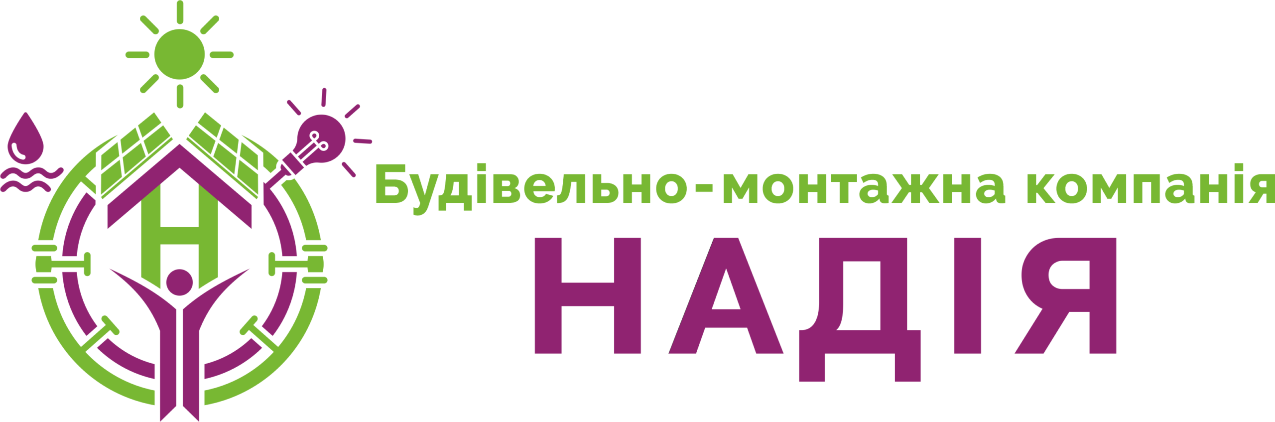
The logo for CMC Nadiya is engineered not as a decorative element, but as a visual blueprint of autonomous life support. The mark is built upon a rigid modular framework, with the letter "H" serving as the central node, transformed into a house silhouette.
An inscribed anthropomorphic figure integrates the human factor into the geometric structure. The outer ring contains icons of the elements: solar energy, the water cycle, and intelligent light. Every line is a vector of development; every angle is a point of reference for future infrastructure.
A business card for the construction and montage sector is not a souvenir, but the first tactile contract of trust. We engineered a double-sided information medium with a strict functional separation (Dual-Interface).
Obverse (Brand Zone): Operates as a manifesto. A dominant logo within a clean space projects structural order and process transparency.
Reverse (Data Zone): Pure information architecture. The core capabilities block is structured through a rigorous mathematical layout with linear icons. The contact cluster respects all user behavior patterns: from classic typography to an integrated QR code for instant data import.

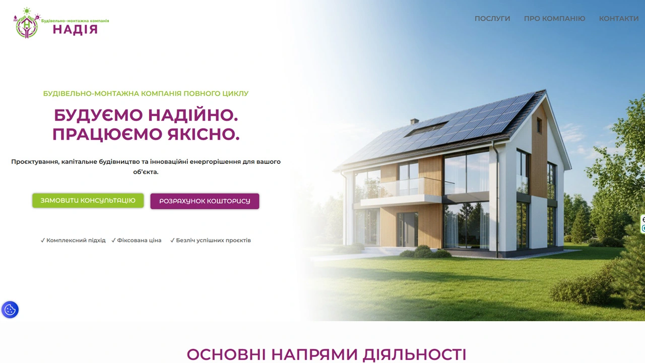
The final phase of the operation is deploying the corporate platform bmc-nadiya.com.ua. We implemented a sharp, brutalist UI/UX layout powered by WordPress. Instead of generic contact channels, complex multi-step lead capture forms are deployed to minimize cognitive load on the client and maximize targeted conversion vectors.