Comprehensive brand engineering: from a core mark to a complete digital ecosystem for the German market.
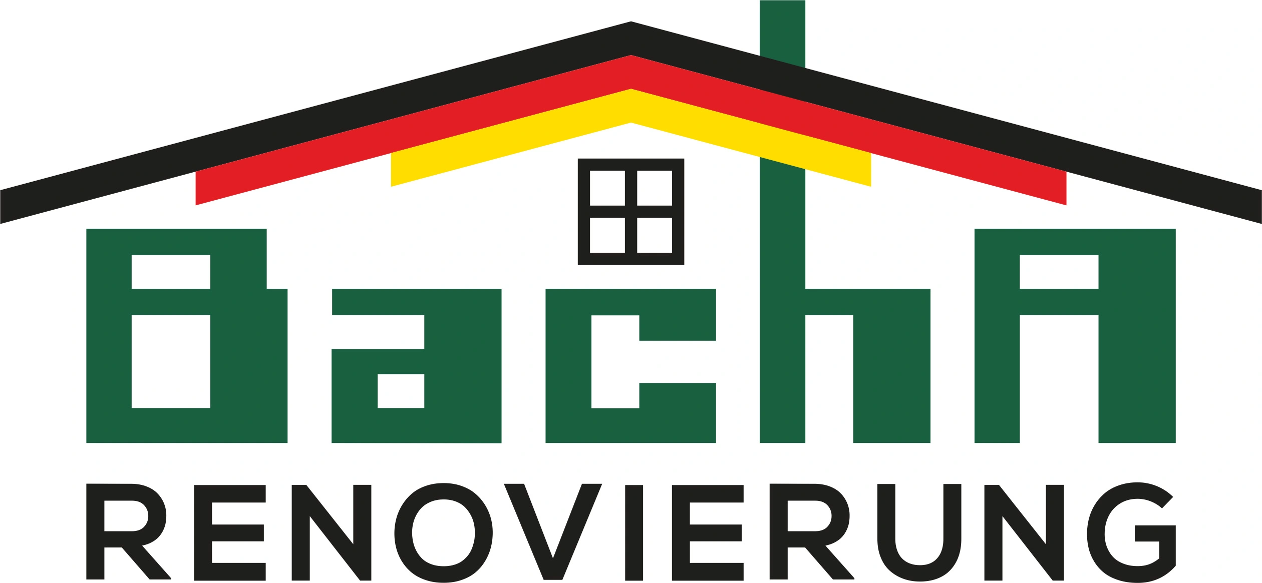
A logo for the conservative German construction market demands absolute straightforwardness. We engineered a mark that operates like a facade blueprint. The national geographic identifier — the German tricolor (Schwarz-Rot-Gold) — is integrated directly into the "load-bearing structure" of the logo, forming the roof line. This builds immediate subliminal trust within the DACH region.
The typography for the Bacha naming is executed in a massive, industrial style. Each letter is designed as a concrete block or steel profile with no unnecessary serifs. Basic architectural anchors — the vertical line of the chimney and the strict mathematical grid of the window — complete the composition, anchoring solid permanence and uncompromising service quality.
Documentation of the sign architecture development. The recording demonstrates the step-by-step construction of the logo with mathematical precision and structural proportions. Every element is built according to the initial engineering layout without accidental lines.
A static sign in today's digital environment is only half the battle. We designed a logo animation that reveals the logic behind its assembly. This is not motion for the sake of motion; it is a systematic demonstration of how Bacha Renovierung approaches spatial transformation: from disjointed elements to perfect structural order.
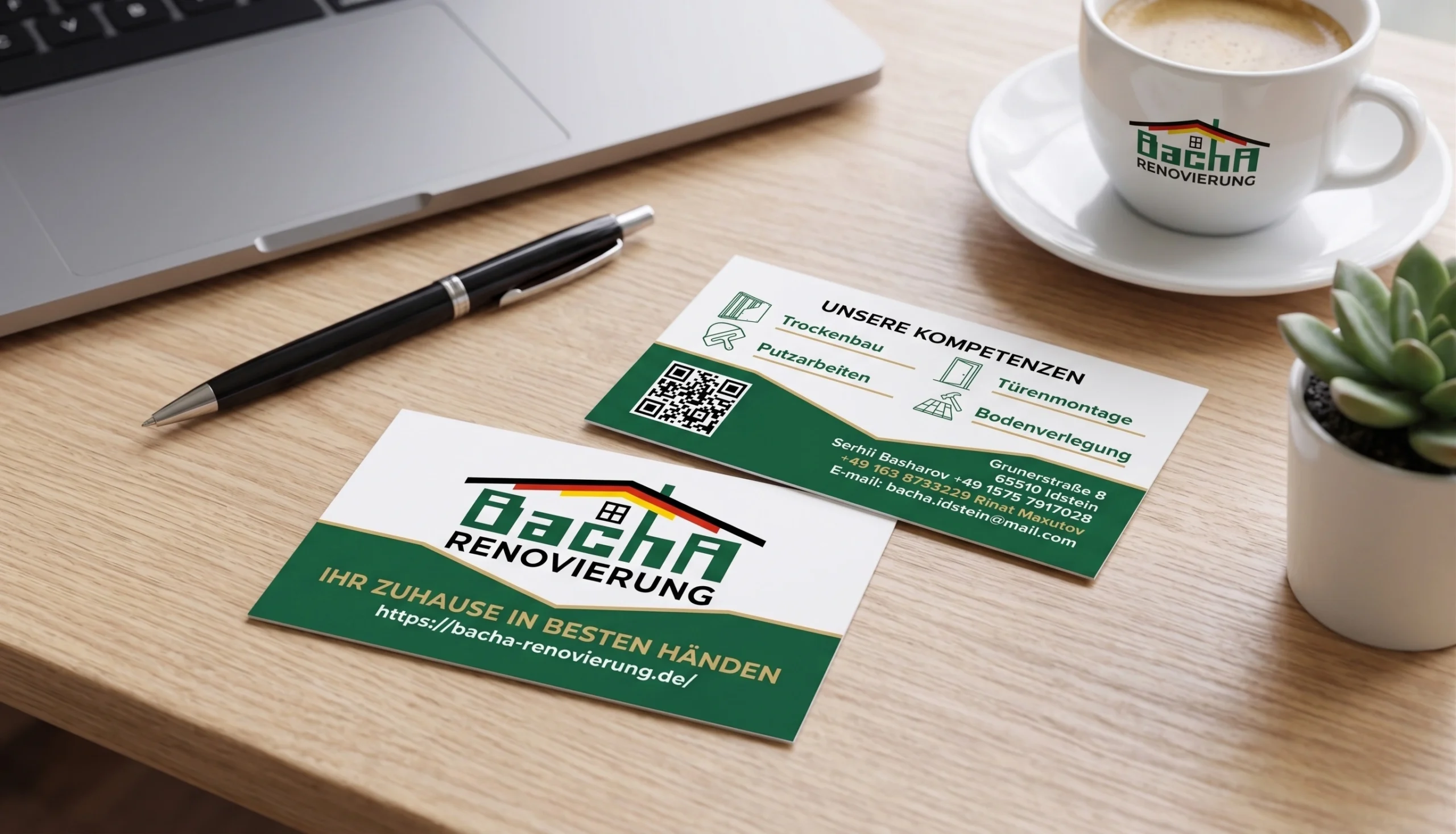
A business card for the German construction sector is not a souvenir; it is the first tactile trust contract. We engineered a double-sided information medium with a strict functional separation (Dual-Interface).
Obverse (Brand Zone): Functions as a manifesto. A dominant logo accompanied by the direct statement "Ihr Zuhause in besten Händen" (Your home in the best hands). The design relies on a dual-axis composition where a golden vector chevron visually stitches the white brand space into a solid green base of stability.
Reverse (Data Zone): Pure information architecture. The core capabilities block (Trockenbau, Putzarbeiten, etc.) is structured through a rigorous mathematical layout with linear iconography. The contact cluster respects all user behavior patterns: from classic typography for conservative clients to an integrated QR code for seamless data import into digital systems.
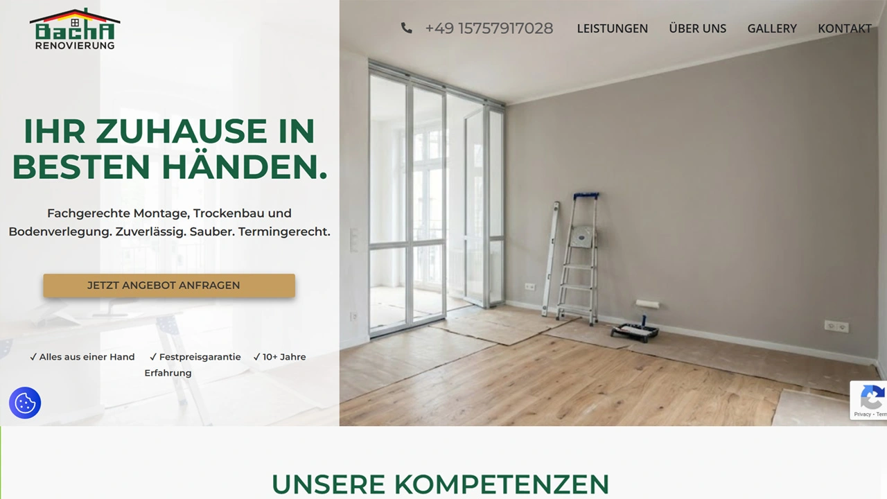
The final phase of the operation is deploying the corporate platform bacha-renovierung.de. We implemented a sharp, brutalist UI/UX layout powered by WordPress. Instead of generic contact channels, complex multi-step lead capture forms are deployed to minimize cognitive load on the client. The node is localized exclusively for the DACH market, maximizing targeted conversion vectors within the region.